A resource to help you understand how we view and promote British American Football as a brand. These guidelines were created to help you navigate the requirements for usage of brand assets including names, logos, typography, and imagery.
Why is it important?
A unified and consistent use of these guidelines is one of the key ways by which we will visibly distinguish and strengthen the equity and hence the value of our brand over the medium and long-term. Using and adhering to these guidelines will help protect our brand integrity.
Why is it important?
These guidelines are designed to help everybody involved in the production of our communications and they also play an important role in building our brand. The design principles have been carefully considered and developed to ensure that our visual identity is consistent
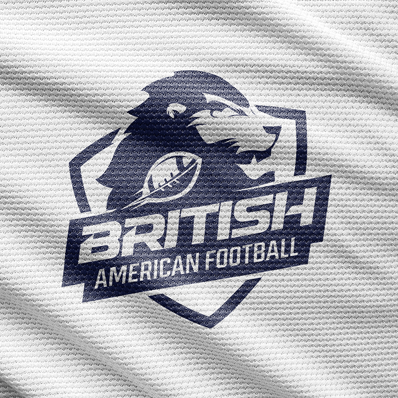
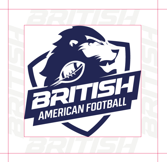
British American Football is more than a badge or logo, it stands for who we are. It is a visual representation of our brand, our values and our commitment.
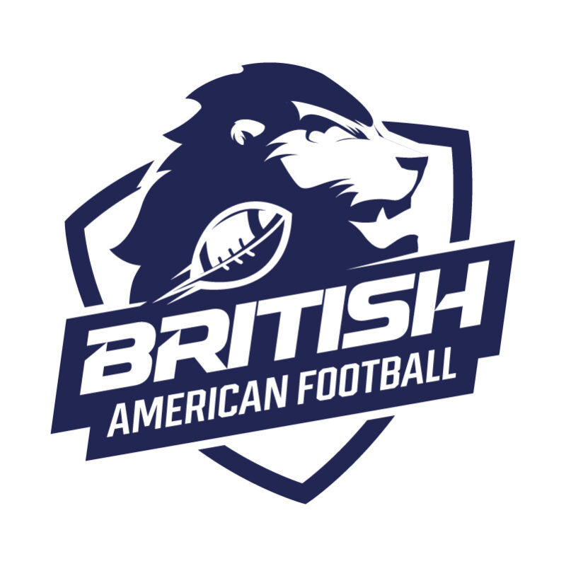
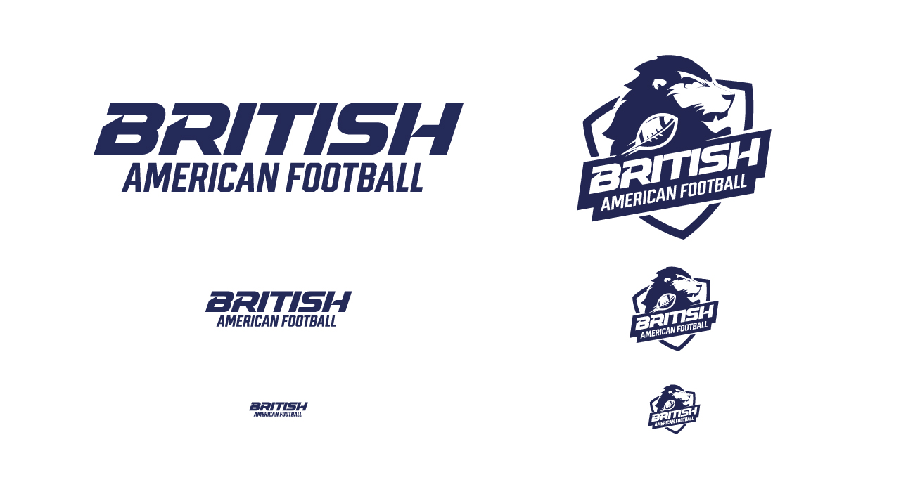
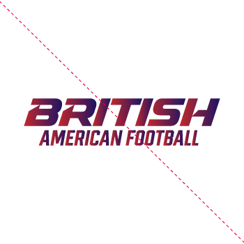
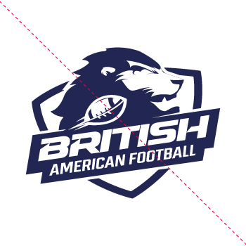
The relationship between each element of our logo has been carefully considered and have been chosen to create a unique, distinctive mark. The relative size and position of the elements is fixed and should not be changed.
Primary Logo
The primary logo must be placed on all printed and electronic communications, both internal and external, for instant brand recognition. If the primary paired logo does not appear on the front of printed items, it must be used on the back of every item. This requirement applies to all publications and branded goods.
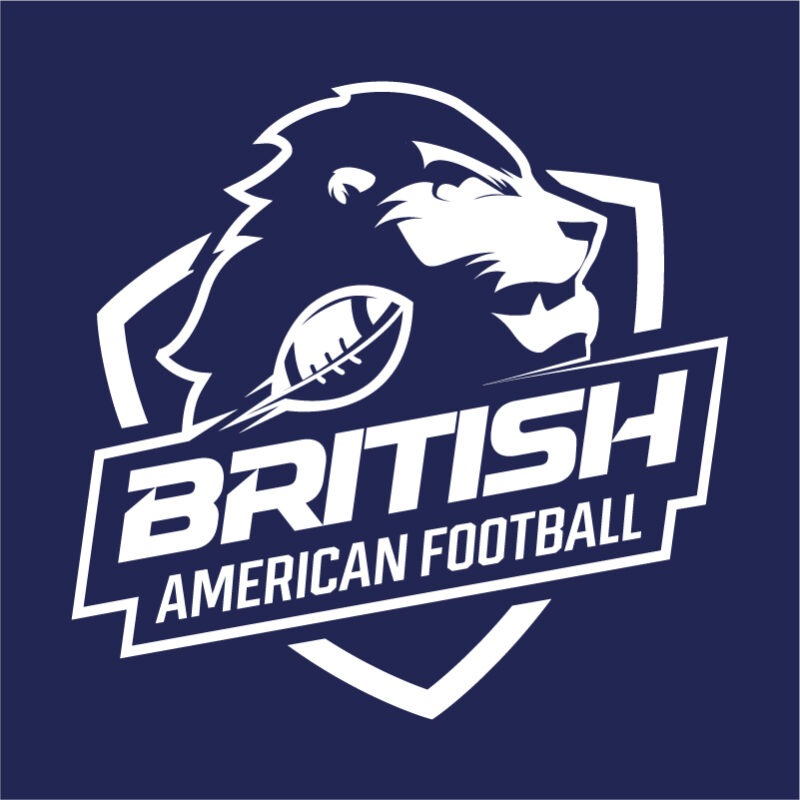
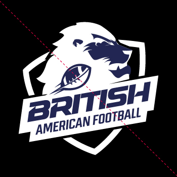
Single colour on dark backgrounds
Single colour on dark backgrounds
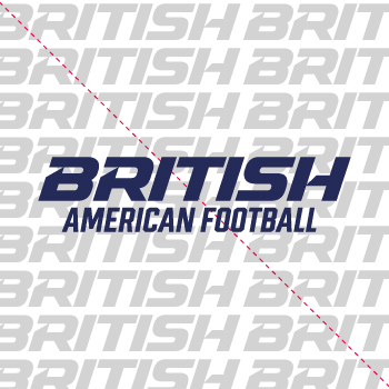
Work Marks
British American Football secondary marks can only be used in conjunction with the primary logo, however the two cannot be combined or used in close proximity. Secondary marks may be used in print and web communications, and on apparel and merchandise. Please be discerning in use, bearing in mind that this mark needs to complement the primary logo.
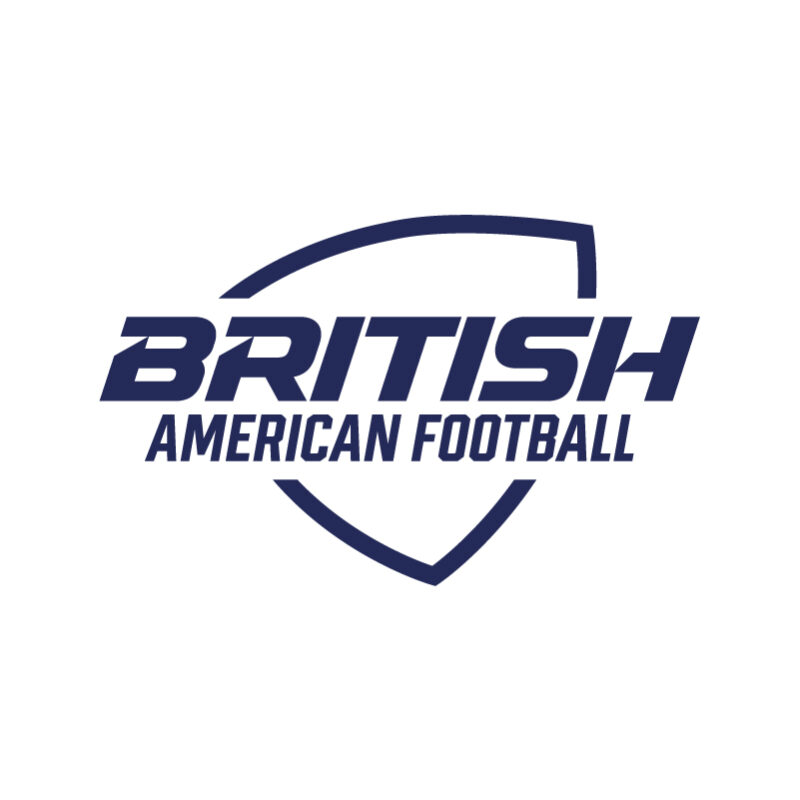
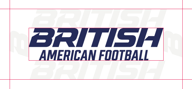
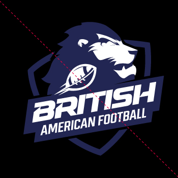
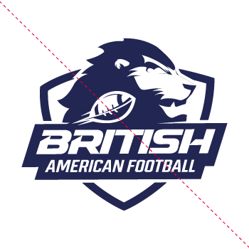
Word mark shield logo
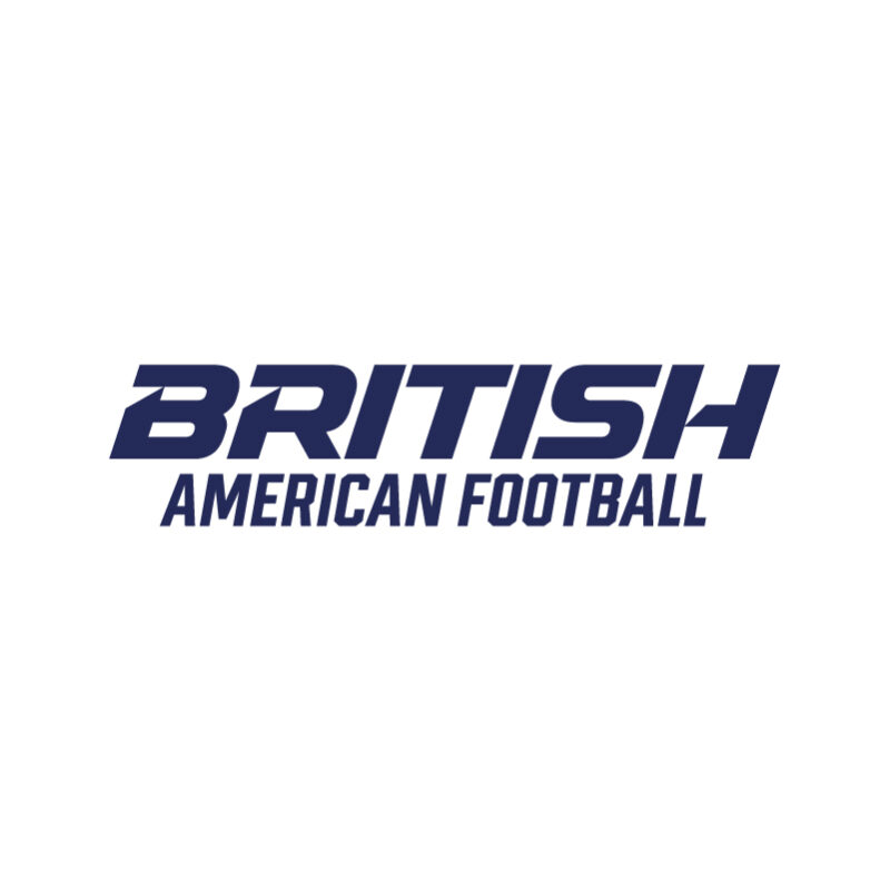
Word mark logo
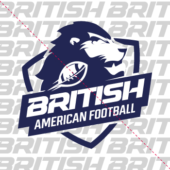
Clear Space
The clear space around the logo does not change. The clear space is measured by the x-height of the “BRITISH” text. No other elements should encroach on the logo’s clear space. Whenever possible, use the maximum amount of clear space the placement in layout will allow.
Clear space around the logo
Clear space around the word mark
Clear Space Exceptions
The logo placement depends on the type of communication and use.
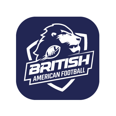
App icons
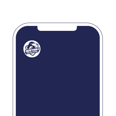
Social icons
Colour & Scale
The logo is designed to scale to small sizes on print and screen. Smallest work mark size: 20 pixels / 8mm height. Smallest logo size: 70 px / 15mm height.
Word mark vs logo scale
Placement
The logo placement depends on the type of communication and use.
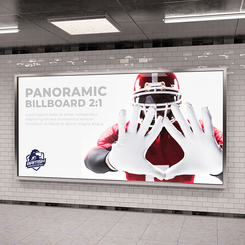
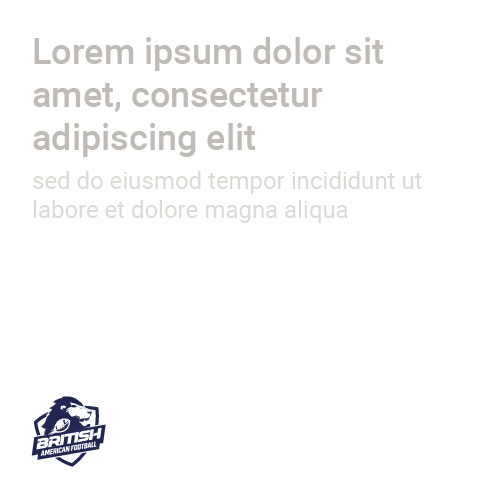
General communications that includes text, logo should be placed bottom left of composition. The full logo should be used on all external communications.
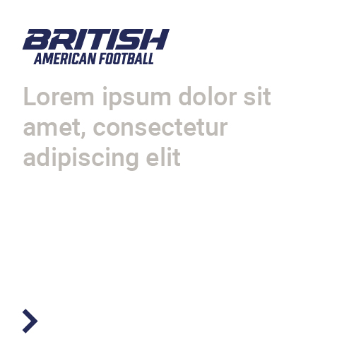
Digital communications such as call-to-actions and websites, as well as functional applications such as environmental signage: logo should be top aligned.
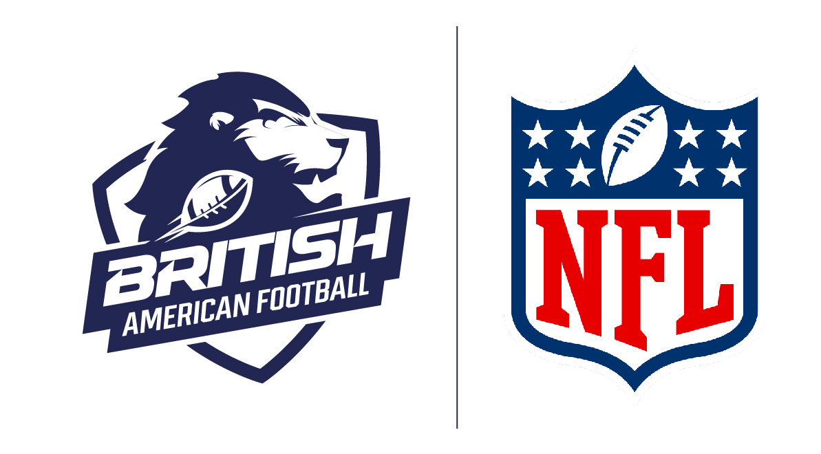
Partnerships
Aligning partnership logos should follow clearspace rules.
Maintain scale and spacing
Guidance
To preserve the integrity of the British American Football brand, make sure to apply the logo correctly. Altering, distorting, or redrawing the logo in any way weakens the power of the image and could create a negative impact on the brand.
Use correct logo on dark backgrounds
Don’t rotate the logo
Don’t stretch or manipulate
Don’t stretch or manipulate
Avoid recolouring the logo
Don’t place logo on busy backgrounds
Use correct logo on dark backgrounds
Don’t rotate the logo
Don’t stretch or manipulate
Don’t invert the logo
Avoid recolouring the logo
Don’t place logo on busy backgrounds
Brand Architecture
A non public-facing team name utilising the brand
Internal teams
A non public-facing team name utilising the brand
Colour
Colour is a great identifier, instantly recognisable and represent who we are. By understanding and exploiting this principle we can use colour to influence the way people think about us and build strong associations with the brand.
Primary Brand Colours
Our primary brand colours are Royal Blue and Imperial Red. They are used to provide accessibility, simplicity, and consistency throughout all brand communications
Royal Blue
HEX: #082853 RGB: 08 40 83 CMYK: 100 87 40 35
Imperial Red
HEX: #d81624 RGB: 216 22 36 CMYK: 7 99 88 1
Secondary Colours
Our secondary colours should be used sparingly throughout illustration, photography, and product in order to maintain meaning and potency.
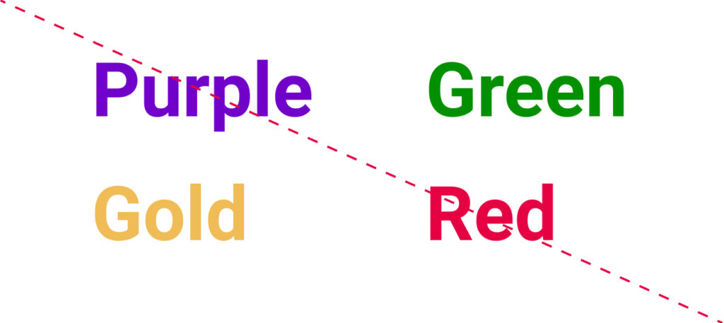
Kings Gold
HEX: #efbc56 RGB: 239 188 86 CMYK: 6 28 73 0
Empire Black
HEX: #000014 RGB: 0 0 20 CMYK: 96 84 55 89
Usage Proportions
It is important to follow the rules of these proportions when creating any brand communication in order to maintain brand consistency and remain accessible for all people. White plays a very important role in all brand communications and should provide balance with primary colours. The secondary colours are only used reasonably for illustrations and within product
Specialty Colours
The specialty colours are designated only for communications that that require variations of tone, gradient and opacity.
Call to action
Hex: #1C5DF5 RGB: 28 93 245
Typography
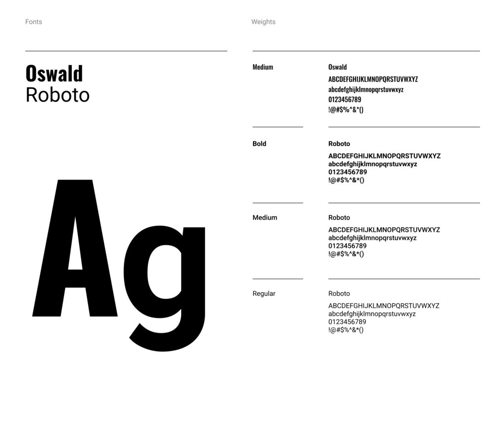
Our typography is designed to maximise the impact across all applications while grabbing the audience’s attention and keeping it easy to read.
Pairings
It is important to maintain these type pairings. This allows for clarity, consistency, and a strong hierarchy for all communications. Medium weight should be paired with Light weight, and Bold weight should be paired with Regular weight.
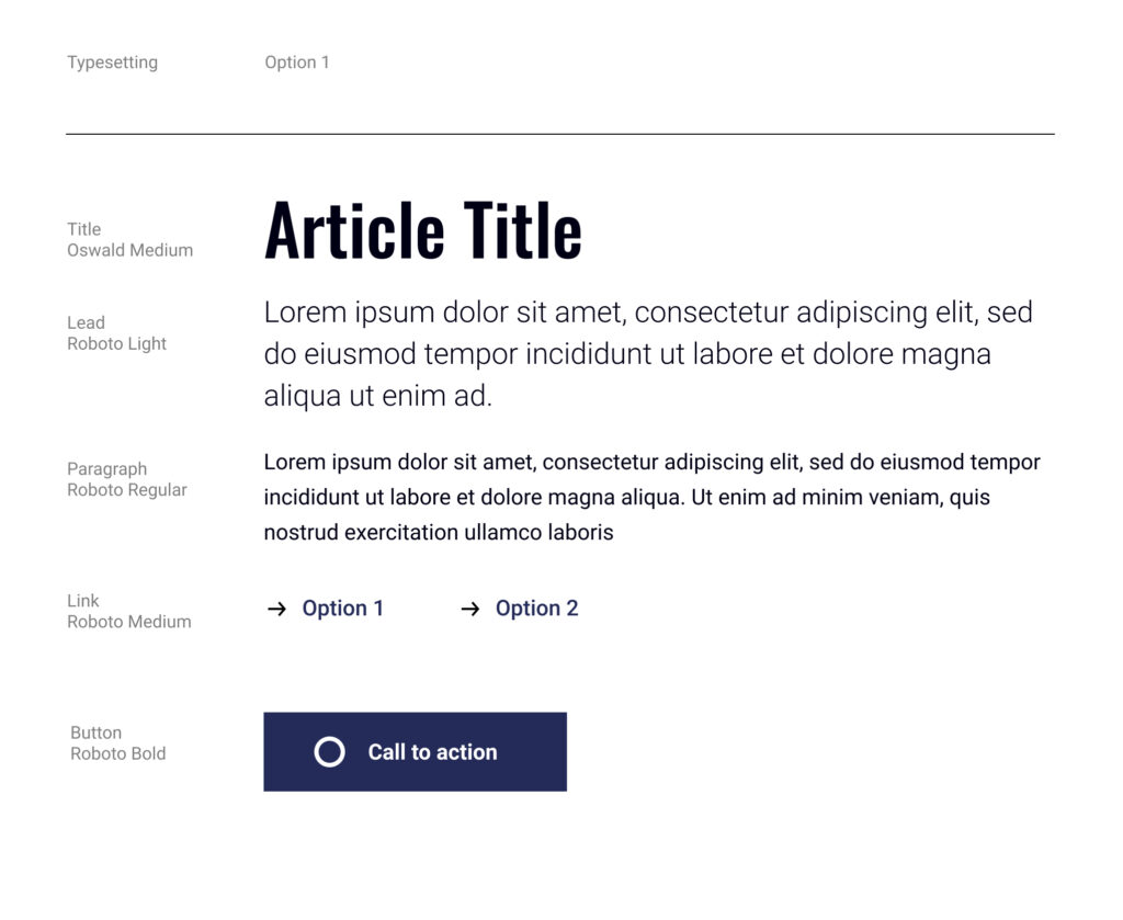
Hierarchy
It is important to organise typography in a hierarchical system according to relative importance or inclusiveness through scale and function depending on communication
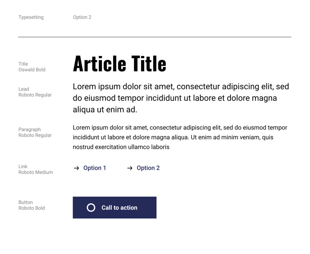
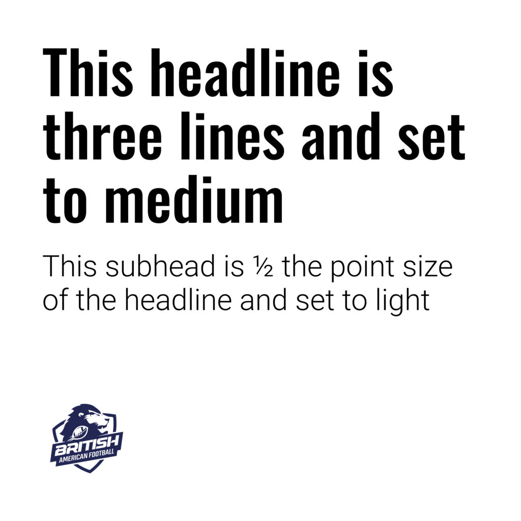
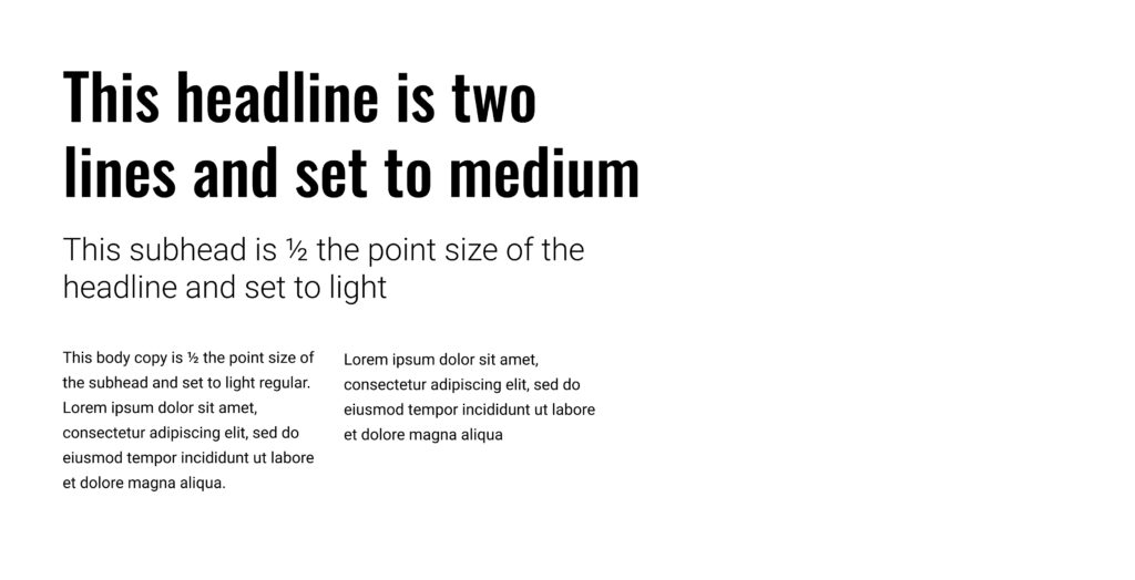
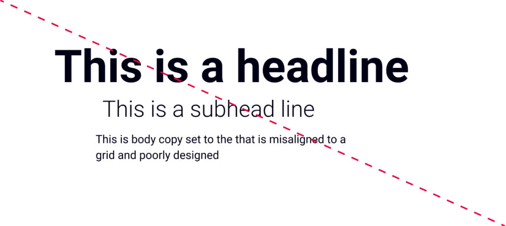
Headline font: Oswald font-weight: Medium line-height: 10% more than the font size letter-spacing: 0
Subhead font: Roboto font-weight: Light line-height: 40% more than the font size letter-spacing: 0
Headline font: Oswald font-weight: Medium line-height: 20% more
Subhead font: Roboto font-weight: Light line-height: 40% more
Body copy font: Roboto font-weight: Regular line-height: 60% more
Call to action
When creating and identify call-to-actions for brand communications, Roboto Bold is to be use for text links and buttons.
Typography Guidance
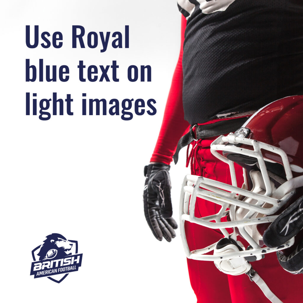
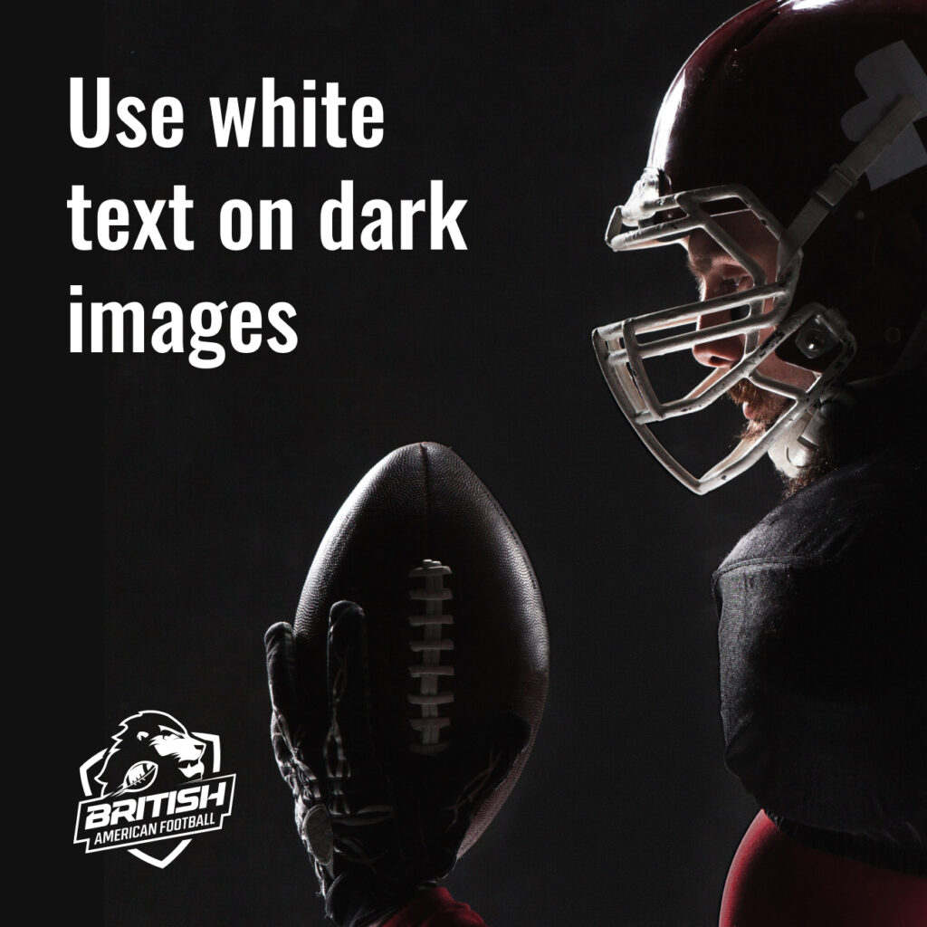
Typography should either be Royal Blue on light imagery or white on dark imagery. When typography is aligned with the logo, typography and logo should be the same colour.
Do not use coloured typography. Only blue, black or white.
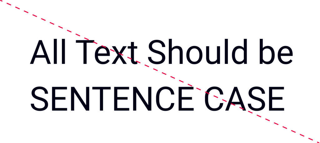
All typography should be sentence case and avoid uppercase
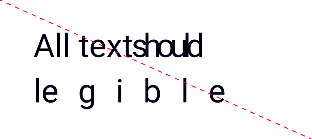
Do not use adjust kerning or tracking
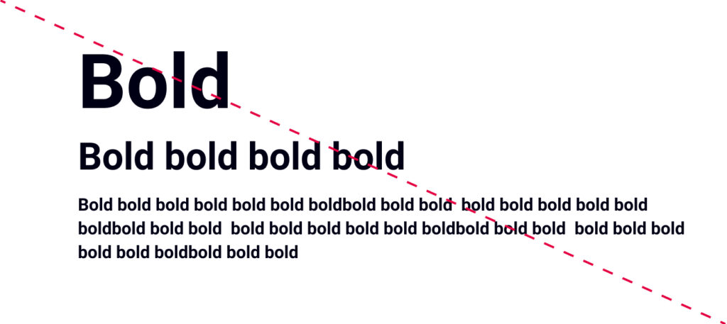
Do not make different levels of hierarchy the same weight
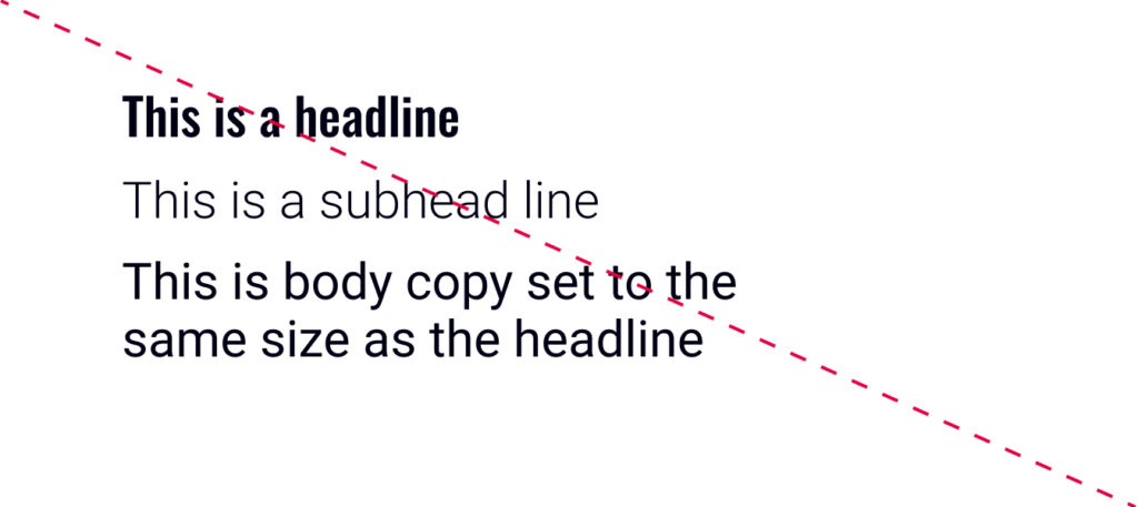
Do not make any level of hierarchy the same size or scale as another
Don’t place logo on busy backgrounds
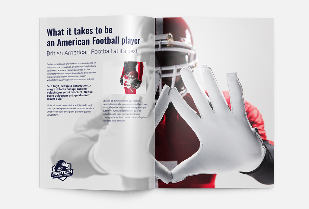
Imagery & Examples
Typography should either be Royal Blue on light imagery or white on dark imagery. When aligned with the logo, typography and logo should be the same colour.
